Stop a few minutes of your day and ask some essential questions:
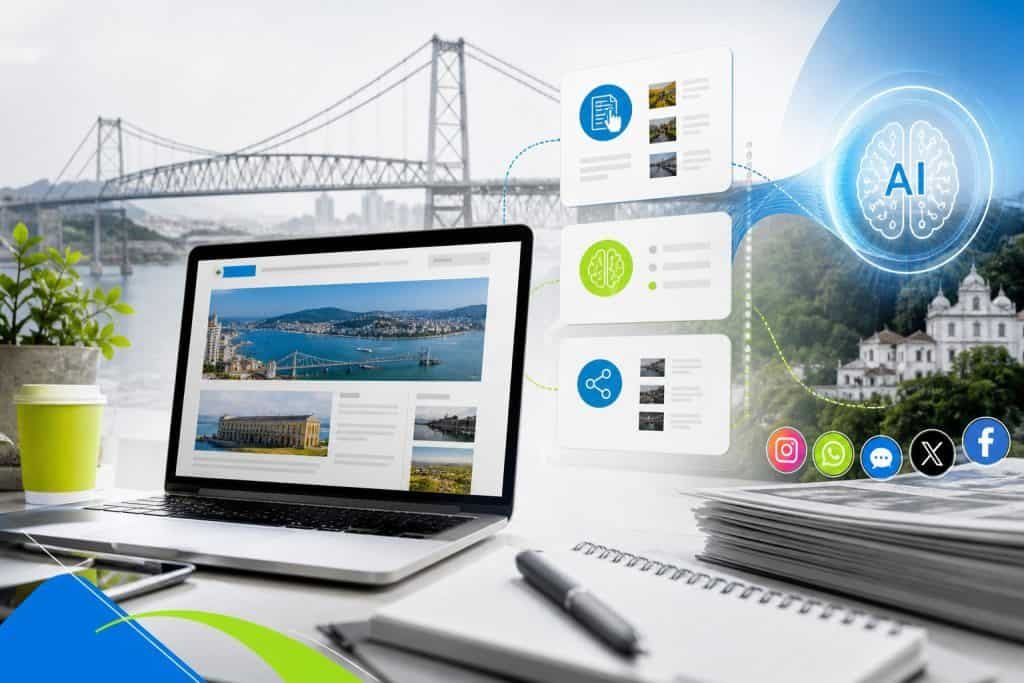
Is your website easy to navigate? Are the layout of your products and services easy to see and understand? Are you having a high rejection rate? This may be the time to improve the site's design to achieve better performance.
If the answer to these questions is “no”, it’s time to review how you designed and optimized your website. It is never too much to apply ideas and actions to improve the site, especially if you are a company and you are faced in the day to day with an ever-increasing competition.
Many of the businesses are currently conducted online. From shopping to marketing and communication with suppliers, people rely on the Internet to help them perform daily tasks. However, companies, blogs and brands are doomed to failure without a website that is at least optimized for results.
And here, it is worth hitting the same button as always: it is not enough to have a site to have an efficient digital presence, it is necessary to update, evolve with the constantly changing technology.
Good practices to improve your website
Remember that the site is the first thing people see when they visit your company. Making a good first impression is fundamental and it may be a challenge to know where to start. Check out below some tips that can help you create an attractive and easy-to-use website.
Use whitespace liberally
It is not about adding extra lines or spaces between the content, but ensuring that the layout is not tight. When a web designer adds blank space to your site, it makes it easier for people to know where one text section ends and another one begins. People will read your text more easily and feel less eye fatigue if they read it for a prolonged period.
Have a simple design
A minimalist design is trendy, it gets more pleasing to the eyes and allows visitors to focus on content rather than being distracted by unnecessary elements. Try using large graphics and plenty of blank space and avoid using many colors. If you want to simplify it, use a primary color on the entire site.
Do not apply any element that is not necessary because people find it difficult and tedious to access a messy and confusing site. To improve the appearance of your site, try simple things, such as limiting the number of colors, images and fonts used.
Keep fonts simple and readable
Avoid using many fonts or styles on your site as this may make it look like a mess. Use a font for titles, another for the text body and a third for links. The content may stand out from the site's design, which is important because people want to read what you wrote, not admire your sophisticated typography.
Use color theory to your advantage
This all good web designer has learned: Color theory and psychology are important, and how they are used affect site conversion. The colors, as they are used and what they represent, are important.
Use this to your advantage when you are designing or updating a website. The use of color theory can add much more to your site and is a site design tip that should not be ignored.
The default language for color communication is called Pantone, and yes, that's real. You should know about this, especially if you are designing a new website for your company:
See what the colors represent and apply without fear of error:
- Red: passion, anger, love, trust
- Orange: youth, joy, warmth, hunger
- Yellow: sunlight, happiness, energy, optimism
- Green: nature, fertility, balance, cleanliness
- Blue: water, tranquility, trust, power
- Purple: nobility, strength, elegance, wisdom
- White: peace, harmony, purity, simplicity, winter
- Grey: neutral, sophisticated, balanced, wisdom
- Black: exclusivity, modernity, power, refinement, mystery
- Brown: land, stability, tradition, nature
- Rose: love, romance, femininity, girls, humanist
- Turks: tranquility, clarity, compassion, healing
Use high-quality images
If you want an attractive design, use high-quality images taken and edited professionally. You can find free photos online or in image banks. If you want something unique and more professional-looking, you can use a production illustration or hire the services of a photographer or artist specializing in creating custom images for websites. It's no use having content in attractive text if the images are out of the main purpose that is a design that performs.
Use attractive Calls to Action
Don't let visitors get lost on your site distracting them with irrelevant content. Use plain, clear decoy phrases in the most apparent places possible so that you know exactly what to do next. This will help them feel strengthened and confident when buying or signing up for their newsletter.
Present important information with markers
Markers allow you to concentrate information into small pieces that are easy to see, so they are an excellent tool to present data or instructions on your site. They also help break down large blocks of text to facilitate reading. Markers also allow consumers to quickly find the benefits, ways to solve their problems and critical features of a product or service.
Make sure the text and background have a good contrast
Contrast colors help to facilitate reading of text on a website. If you use clear text on a dark background, ensure enough high contrast elements (such as images) to highlight the text clearly against the background.
If you use dark text on a clear background, make sure there are enough low contrast elements (such as white space) so that visitors have no problems reading your content. However, try not to exaggerate, since much contrast can distract and harm the eyes.
Easily navigate
Your navigation bar should be easy to find and use. Visitors will only spend time searching for it if they can immediately locate it when entering the homepage or the destination page of your site. A navigation bar should consist of links that take visitors directly to important areas of your site, such as the pages “About us” and “Talk to us”, as well as links to product pages, shopping carts, etc.
Leave your mobile site compatible
When creating your website, it is essential to ensure that it looks good on all devices, from the smallest phone screen to the largest desktop monitor. Mobile-compatible sites have become increasingly crucial as mobile phones have evolved to powerful computers to access the Internet. If your website is responsive, you can avoid the loss of potential customers who visit you on your smartphones and don't like what they see.
Sites that are not compatible with mobile devices may seem confusing and difficult to navigate on a small screen, which can drive users away. A study found that more than half of consumers leave websites if they do not load correctly on mobile devices.
Review the content as to accuracy!
Needless to say, inaccurate information will drive consumers away, be it a wrong number, outdated product information or simple grammatical errors. Therefore, you should review each page before going on air and periodically check each page, especially after making updates elsewhere.
Tip: Whenever you update essential information about your company on your website, also update your social networks, and also in the Google My Business company profile, as well as other websites on which your company may appear.
Make your offer irresistible
Visitors usually come to your site in search of solutions to your problems. Knowing what solutions they're looking for can help you create an offer focused on solving them. For example, if you sell real estate your share could be: “Download the e-Book Guide to the best neighborhoods of beaches to live in Florianópolis”.
In addition to these tips, visiting your site as if you were a potential customer is also a good idea. Find out which parts are annoying (long loading times; many clicks to get somewhere) and work to fix these problems. And here it costs nothing to remember that Google considers that a high-performance website needs to fully upload in up to 3 seconds.
In addition, visit other sites in your sector, study the competition to get ideas about what is attractive. Then implement these ideas on your website.
Before making any changes to your website, check Google Analytics (update to GA4) and site statistics to document a baseline. So, when making one or two changes at a time, analyze the changes you see in traffic and conversions to determine what is getting the best results.
What about SEO?
Having a proper SEO will do a lot of things to improve your site. Above all, it will allow you to have a higher rating on Google and also allow you to have a tendency to what you want and be correctly indexed in search engines. Focus on keywords and phrases.
People scan web content, so you should create titles and subtitles with the keywords and phrases your target audience is looking for. Don't let your audience question what you sell.
In addition, consider a security certificate (SSL) if your website does not yet have one. Google has boosted https protocol and best-rated sites with these certificates.
Conclusion
Considering improving your site or starting a clean slate? Count on the 18-year-old expertise of National Vox – Nvx Digital. We have already developed and delivered hundreds of websites to companies inside and outside Brazil, always configured for high performance on the internet. Check it out HERE our portfolio and contact us!