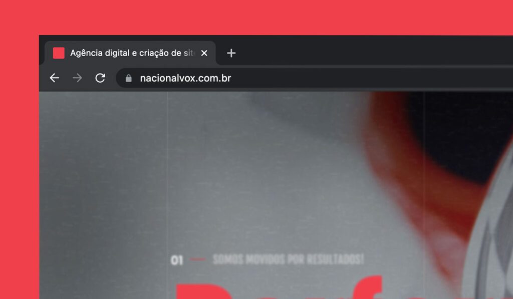
The favicon is a small icon of 16 × 16 pixels that serves as a brand for a website. Your main goal is to help visitors locate pages more easily when there are several open tabs in the browser.
By the tiny size, favicons work better as simple images or from one to three text characters and should not be confused with logos, but sometimes are the same. Due to its small size and resolution, the favicon may need to be an even smaller size or part of the original logo of the company.
See also:
- WaveMaster AI closes 192 spots in Brazil by integrating 20 monitored beaches and over 800 beaches on 6 continents
- Forget the “123456”: How a Password Manager Can Simplify Your Digital Life (and Avoid Head Pain)
- Password Manager: The Unnegotiable Pillar of Your Digital Security in the Connected Age
- The Power of Google Evaluations: How to Improve Your Business’s Reputation
- How to make a diagnosis of your website performance
- CRM for real estate and construction companies: boosting sales and loyalty to customers
- Best practices for digital security on websites
- Does organic reach still make sense in digital marketing?
Where can you see the favicon?
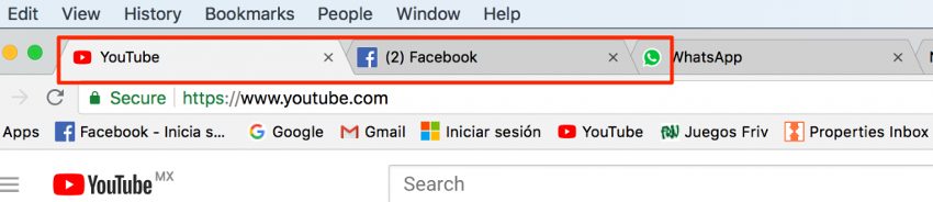
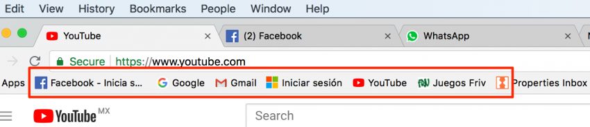
Favicons are found next to anything that identifies your site. This includes bookmarks, guides, toolbar apps, history results, and search bars. Check out examples of image below:
Why are favicons important?
Creating a favicon is a small but important step to set up a business site. It adds legitimacy to your website and helps boost online branding as well as potential consumer confidence. They are also an immediate visual marker for the site that allows easy and fast identification for web users as well as unifies all the various browser components in a well-marked browsing experience.
Currently, most people who use the Internet regularly are used to seeing favicons. The average Internet user probably doesn't know much about them. However, they appreciate their presence and definitely realize their absence.
The brain can process images much easier and faster than words. When browsing a bookmark list, users can quickly find the site they want with the favicon that follows it.
The same thing happens when an Internet user has several open guides; favicon makes it easier to distinguish between different websites.
If a site does not use a favicon, there will simply be a blank page listed next to the site name. When a user has multiple favorites without a favicon, the selection of the desired site becomes much more difficult, as all blank pages will look the same.
Easy to use sites lead to greater use
Is this about SEO? Yeah...
Having an easy-to-use website indirectly improves the ranking of your search engine. Having a favicon visible in browser guides, bookmarks, history files and so on helps your users save time, allowing them to identify and navigate your site without difficulty, thus increasing the likelihood of user interaction with your website.
This will improve time spent and interactions with your site, which means that more eyes will be on your site for longer, thus improving your SEO.
How to create a good favicon
Many things need to be taken into consideration when creating and designing a favicon for your website. Although small and simple, it can (and should) have a great impact. It is important to ensure that you produce the best favicon possible, as this is what users will identify your brand with.
Here are some things you should keep in mind when creating your favicon:
Use space wisely
Sometimes a favicon can't always be just a smaller version of your company logo. One should take into account the overall size of your favicon. You should limit yourself to 16px, as this is acceptable for all browsers.
Bookmarks
A favicon offers an advantage over sites that do not use it. Google's Chrome browser deduces certain search ranking signs for websites marked on the web. If you don't have a favicon on your site, you may lose the chance of being marked in Chrome browser, indirectly losing one of the many search rating signs.
In addition, being marked and visually highlighted in this list of markers due to your favicon puts your site in a better position to be revisited by users. All of this increases site traffic and SEO.
Branding and visibility
A favicon is a visual representation of your site and company, so that users identify with your brand based on the favicon you use. SEO has everything to do with branding and marketing and the more visible your site is, the more users will probably click on it and remember who you are.
Simplicity
Although favicon is the visual face of your brand, you want to keep your design as simple as possible. The best favicons are the simplest. Due to the small size and simplicity of the shapes used, the colors are vital to draw the attention of potential consumers and stand out. A lot of details will only make Favicon look messy and messy.
Brand identity
Your favicon is the visual icon of your brand, so you should visually inform users what your company represents. That tells them instantly what their brand is about and what it does. Although this is very difficult to do with such a small and simple design, try to be creative.
The examples below demonstrate the power of small creative favicons; at first glance, you can instantly get what the brand is about and what they represent:

Color coordination
The choice of color must also come into play. The contrasting colors facilitate the recognition of the shapes and focal point of your favicon. Due to the small nature of favicons, you need to clearly represent your business to the user, and the use of colors can be vital. Remember that all browsers are slightly different. For example, some have a gray, black or white background on which their Favicon will be placed.
What formats to use for a Favicon?
In contrast to the past, when a favicon needed to be in Windows ICO format, there are now some different formatting options. Check each one more deeply:
Windows ICO: ICO is by far the file with the widest support. The benefits for ICO are that it can contain multiple resolutions and bit depths, which works very well and is especially useful for Windows. ICO also offers a 32 pixel icon that is useful for the Windows 7 taskbar of Internet Explorer. It is also the only format that does not use the <link> element.
PNG: the PNG format is useful for several different reasons. You don't need any special tool to create a PNG file, which makes it very friendly. It provides us with the smallest file size possible and supports alpha transparency. However, a major disadvantage of this style is that Internet Explorer does not support PNG files; it only supports ICO files.
SVG: this format can be used and is compatible with Opera browsers.
GIF: this format offers no advantage out of use in old browsers. Although they attract more attention to users, they also tend to irritate, and the general consensus is that they do not represent an advantage at all.
JPG: although this format can be used, it is not common and does not offer quality resolution as good as PNG. In addition, due to the small size of favicon, JPEG loses all its benefits.
APNG: This is an animated version of PNG and although it can be supported by Firefox and Opera, it has the same problems as animated GIF, distracting users while looking at its interface.
Starting for practice:
Is it necessary for a custom favicon? No, no, no. However, I have already highlighted here that they help greatly improve the overall quality of the visitor experience. If you are ready to create a favicon, update your WordPress pattern or enhance an outdated design, follow some tips on what you need to do:
- Search for a free favicon generator on the web (there are many to choose from)
- Create your file (16 by 16 pixels)
- Go to the image section of your theme
- Add or replace the standard favicon with your custom design
- Remember, a favicon is a very small image. Don't add too many details and don't be too sophisticated. An indistinguishable favicon is no better than any favicon.
- Try using the initial letter of your company name in a different font. Google favicon is a perfect example of this. Although it may seem like a simple way to do this, using your company's initials can be as basic or elaborate as you want.
Conclusion
If you're new to the online world, this may be the first time you've thought of your favicon. As a business veteran, it's probably been several years since you looked at your personalized image.
Anyway, make sure your favicon is an asset and not an obstacle to your website's success.
Keep in mind that companies are competing for the attention of the user in the digital world. Every detail of the project is important. Make sure your website stands out from the crowd. Due to the size of the favicons, many people do not think it is worth investing in their developments or designs.
However, investing your time and energy in this once will bring more brand engagement and recognition to your company and make it easier for the user to find it in the variety of open guides. Create a favicon that represents your brand and start seeing the benefits of using it.