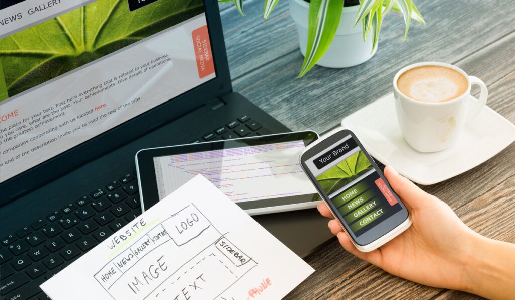
Website design is an area in constant evolution, always shaped by changes in aesthetic, technological and behavioral preferences. In recent years, an approach that has been gaining prominence is minimalism, which has emerged as a reaction to the excess of decorative elements. Minimalism aims to simplify the user experience, focusing on the essence and also functionality.
Here in the Nationalvox – NVX Digital, we have been building sites with a platform of our own or partners and following trends for better delivery to our customers. So I come here to share a concept that will let you update on a doubt that surrounds many companies:
What style of website should I have to stand out in competition and market?
In this article, I will exclude the evolution of minimalism in the design of websites, highlighting emerging trends of the minimalist concept that are redefining digital aesthetics.
Contents
Toggle- Less is more!
- Advantages of Minimalist Design
- Classic Minimalism: simplicity as a priority
- Express typography: going beyond the images
- Microinteractions: those details that make a difference
- Vibrating Colors in Balance
- Controlled Asymmetria: breaking stiffness
- Examples of minimalist design in practice!
- Conclusion
Less is more!
Advantages of Minimalist Design
Quick Loading: minimalist sites usually load faster, improving user experience.
Better readability: simple sources and proper spacing facilitate reading of the content.
Adaptation to Mobile Devices: minimalist design adapts well to different screen sizes, providing a consistent experience on mobile devices.
Classic Minimalism: simplicity as a priority
When it came up, minimalism in site design was characterized by clean layouts, generous white spaces and a reduced color palette. The emphasis was on removing unnecessary elements, providing a more enjoyable and easy-to-understand visual experience. Companies like Apple and Google have pioneered this approach, influencing digital aesthetics for years.
It is important to highlight that the prioritization of simplicity does not mean a renunciation of luxury or beauty, but rather a search for these elements in a more conscious and deliberate way. Each piece and detail is carefully selected, and the quality of the materials will gain prominence.
Classic Minimalism values craftsmanship, durability and timelessness, rejecting the ephemerality of passing trends.
The color palette used in Classic Minimalism on websites usually consists of neutral tones such as white, black, gray and earthy tones. These color choices contribute to a serene and sophisticated atmosphere, promoting the feeling of calm and visual order.
The classic minimalist architecture emphasizes above all functionality, with well-lit and clear spaces. The interior design, in turn, highlights elegant and simple furniture, often of straight lines, without excess ornaments. The idea is to create an environment that inspires tranquility and reflection, eliminating excess to allow the essential beauty of each element to stand out.
See also:
- WaveMaster AI closes 192 spots in Brazil by integrating 20 monitored beaches and over 800 beaches on 6 continents
- Forget the “123456”: How a Password Manager Can Simplify Your Digital Life (and Avoid Head Pain)
- Password Manager: The Unnegotiable Pillar of Your Digital Security in the Connected Age
- The Power of Google Evaluations: How to Improve Your Business’s Reputation
- How to make a diagnosis of your website performance
- CRM for real estate and construction companies: boosting sales and loyalty to customers
- Best practices for digital security on websites
- Does organic reach still make sense in digital marketing?
- Optimizing AI Ads for Digital Performance
- What territorial marketing is and how to do
Express typography: going beyond the images
An emerging trend in minimalism is the emphasis on expressive typography. Designers use distinct and prominent sources to communicate the main message of the site. This not only demonstrates personality, but also reduces image dependency, improving loading speed and accessibility.
It is as if it were a break of tradition, adopting distinct and prominent sources to convey the main message in projects. This innovative approach not only adds a significant layer of personality, but also revolutionizes the way we handle images on a website, promoting efficiency and accessibility.
The expressive typography in minimalism is not only a stylistic choice, but also a conscious strategy to simplify communication. By raising the sources to a prominent role, web designers can convey the essence of the message clearly and impactfully, often without the need for additional visual elements.
This approach not only simplifies aesthetics, but also contributes to a more direct and efficient user experience, contributing to SEO issues and accessibility.
Microinteractions: those details that make a difference
In the universe of minimalism currently applied, an intriguing tendency stands out for the importance given to subtle details: microinteractions. It is in these small gestures, often imperceptible at first sight, that the difference lies between a common digital experience and a truly captivating one. Microinteractions add a layer of sophistication to simplicity, turning each interaction into a memorable moment for the user.
It consists of elements such as soft animations when rolling a page or delicate visual feedback when interacting with the interface elements that are the essence of microinteractions. In a minimalist design context, where each element is carefully chosen, these details reveal themselves as true hidden jewels, hoping to be discovered.
Instead of competing for the highlight, these subtleties complement the general aesthetics, enriching the user's experience in sublime ways. When rolling smoothly over a page, for example, elegant animations can provide a sense of continuity and fluidity. This touch of movement not only softens the transition between sections, but also keeps the user engaged, creating a more dynamic and enjoyable experience. Think that each slip becomes a visual journey, in which attention is guided in a natural and intuitive way.
The impact of microinteractions can go beyond the aesthetic aspect, influencing the usability and general perception of the brand or platform, demonstrating a commitment to quality and attention to detail, building the much desired relationship of trust with the user.
In a world saturated with digital stimuli, it's these little details that make a site or app stand out, leaving that impression lasting.
Vibrating Colors in Balance
The introduction of vibrant tones in site design is not a mere concession to aesthetic whim. It's a response to the search for greater visual expressiveness. Strategically highlighted elements by bolder and more vibrant colors gain life and relevance, directing the viewer's gaze intentionally. This practice not only breaks monotony, but also provides a more dynamic and engaging visual experience. But common sense is fundamental!
Moderate use of these intense colors must safeguard the essence of minimalism, preventing design from ever falling into the trap of extravagance. Each vibrant hue is chosen for some purpose, either to highlight calls to action, transmit energy or simply create strategic focal points. Above all, the vivacity of colors must coexist in a balanced way with minimalistic purity, creating a unique and attractive fusion.
Take into account that the presence of vibrant colors not only enriches the visual, but also opens up new possibilities for expression and communication. In a world where aesthetics plays a key role in the perception of the internet user audience, the balanced combination of vibrant tones and minimalism creates a contemporary and engaging visual language.
Controlled Asymmetria: breaking stiffness
Designers, always eager to explore new aesthetic boundaries, are adopting asymmetric layouts on websites to inject a dose of dynamism and modernity into projects. This approach not only challenges established conventions but also offers unprecedented creative freedom while maintaining an organized structure that results in a unique visual experience.
The power of controlled asymmetry lies in the deliberate break of traditional symmetry. By challenging the idea of perfect balance, it is allowed to create compositions that instigate and stimulate visually. Non-uniformly arranged elements give an air of vitality and movement to design, inviting the observer to explore the complexity and unpredictability of every detail.
The asymmetric layout of elements on a site allows you to play in proportions, direct the focus to specific areas and create a dynamic that captivates the attention of the observer in an innovative way. This bold approach to controlled asymmetry not only breaks paradigms, but also resonates with a contemporary audience, which seeks distinct and stimulating visual experiences.
By challenging predictability in site building, asymmetric designs offer a visual journey that involves and inspires, providing a glimpse of a world where asymmetry is celebrated as an expression of creativity and originality.
Examples of minimalist design in practice!
Check out some well-known websites in the market that adopt minimalist design as part of their visual approach, highlighting simplicity, clarity and functionality:
Apple (www.apple.com): Apple is known for its minimalist approach to both products and its website. Clean design, intelligent use of white space and emphasis on visual images create a cohesive user experience.
Google (www.google.com): The most widely used search site in the world is a classic example of minimalist design. The homepage consists mainly of a search bar and some links, maintaining simplicity and ease of use.
Airbnb (www.airbnb.com): Airbnb adopts a minimalist design to visually highlight travel experiences. Careful use of large images and white spaces creates a clean and easy to navigate interface.
Conclusion
The minimalism in site design continues to evolve, adapting to cultural and technological changes. Emerging trends highlight the search for balance between simplicity and expressiveness, introducing elements such as expressive typography, microinteractions and vibrant colors.
Controlled asymmetry adds an additional dimension to digital aesthetics, challenging the rigidity of conventional layouts. As minimalism reinvents itself, designers face the thrilling task of creating digital experiences that are visually impacting, functional and adapted to the expectations of users in constant transformation.
You still don't have a website or want to apply minimalist design to your project? Talk to me here. NVX Digital will help you in this process!